UW-Green Bay Style Guide
Strong, consistent design strengthens recognition and speeds approval. Use these standards when creating merchandise that features UW-Green Bay names, logos or identity elements.
Official Colors
The official school colors of the University of Wisconsin-Green Bay are Phoenix Green and white.
Phoenix Green
PMS 343
Process 95C, 15M, 62Y, 58K
#0F5640
White
Process 0C, 0M, 0Y, 0K
#FFFFFF
Secondary Colors
These secondary colors give flexibility and a brighten the overall UW-Green Bay palette.
Bright Green
Process 67C, 0M, 98Y, 5K
#1BA72E
Black
Process 0C, 0M, 0Y, 100K
#000000
60% Black
Process 0C, 0M, 0Y, 60K
#666666
Accent Colors
Orange
Process 0C, 55M, 90Y, 0K; #E37100
Teal
Process 60C, 0M, 31Y, 0K; #289A8F
Cool Gray 9
Process 4C, 2M, 0Y, 52K; #75787B
*Contrast Warning: Bright green, orange, and teal don't have sufficient color contrast with other colors in the UW-Green Bay palette to meet digital accessibility standards. Be careful when using these colors with text or icons. Color contrast is insufficient for small glyphs. It should only be used on large text or non-text graphical elements.
Approved Logo Color Treatment
The official University marks should appear in Phoenix Green, black or white, if possible. When limited to the use of one or two colors, use white reversed out of solid color.
Phoenix Green
![]()
Black
![]()
White
![]()
Safe Zones
Please no crowding! There must be an appropriate margin around the primary identity marks. A good minimum space would be the equivalent of the width of the “G” at the start of the words Green Bay in the two-line wordmark — and there should be no extraneous lines, shadowing, type or images intruding. A mark need not be large to be effective, but it should have ample space around it for legibility and visual integrity.


Minimum Size
To preserve the legibility and recognition of the primary identity marks, the wordmark’s “Green Bay” should be no smaller than one inch wide.


Phoenix Emblem Use
The Freestanding Phoenix Emblem
When the Phoenix emblem is used as a freestanding graphic design element — separated from the wordmark — it is no longer regarded as a primary identity mark. Additional flexibility is therefore available regarding its use as a secondary or primary design element, especially when only a portion of the emblem is depicted.
Used Informally, the Phoenix Requires a Formal Partner
Use of a full or partial Phoenix emblem as a graphic design element is never a substitute for using one of the primary identity marks, if such identification is required. In fact, use of the emblem as a design element in or throughout a piece creates a corresponding requirement to use, in a place of ownership, a primary identity mark featuring the full Phoenix emblem.
Typography
In combination with the University logo, photos and other graphic elements, typography plays a key role in communicating UW-Green Bay’s visual identity. The University mark is set in a typeface named Calisto. Please don't attempt to build your own University marks.
Headline Typeface
Lemonmilk is a modern geometric sans-serif typeface designed in 2014, known for its clean lines, sharp edges and all-caps aesthetic. Use Lemonmilk for:
- Bold, block-style lettering
- Used for large, high-impact display headings
- Can be styled with outline (stroke) and no fill
Lemonmilk
Lemonmilk
Primary Typeface
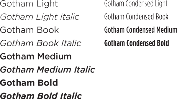
Gotham is an evenly weighted, complementary font that has great legibility for headlines and body copy. Though Gotham comes in a variety of weights, minimal variation is best. The use of more than two or three different sizes in a single printed piece isn't recommended. Gotham may be purchased from typography.com.
Arial is an acceptable substitution when Gotham is unavailable.
Brand Voice in Naming
University Name
The institution’s full name, University of Wisconsin-Green Bay, is a good choice on first reference in most text. UW-Green Bay is acceptable on first reference when context or audience makes the identity clear. UW-Green Bay is always acceptable on second and subsequent references. The article “the” is not part of the formal name. The formal name includes a hyphen (no spaces), not a comma.
- University of Wisconsin-Green Bay
- UW-Green Bay
- UWGB (local, limited informal use)
‘Phoenix’ Usage
“Phoenix” is always singular. To assure proper usage, the word “team” should be interchangeable with the Phoenix.Example: The Phoenix is on a winning streak.
Outside of the Athletics reference, Phoenix is also an acceptable editorial reference to alumni, the student body as a whole or various programs. The “Phoenix” in Phoenix Club, Phuture Phoenix, Phoenix Bookstore, etc., share this historic, University-wide connotation.

Have Questions?
If you have a special scenario that you're not sure about that's not addressed in these policies or something's unclear, just ask. We're happy to guide you.